How UX Designers Help Freight Brokers Transform Logistics Management
Carrier Relations | Business Advice | Technology | Logistics | Transportation | Agent Program | Shippers | Freight Broker
User experience (UX) focuses on consumer interactions with businesses, products, and services through websites and applications. As a leading logistics services provider, Armstrong invests heavily in understanding how shippers, carriers, agents, and employees engage with our transportation management system (TMS). More than a logistics tool, our proprietary TMS, ATGFr8, drives clarity, automation, and enhances data quality to simplify freight management cost-effectively.
Understanding the UX and developing the structure of our digital solutions with the user experience in mind is an integral part of Armstrong’s business strategy. In this blog post, we shed light on how UX Designers make it all work.
But first, think back to the days before Uber and Lyft. Do you remember what it was like to call and ride in a taxi? It was a world of unknowns. Would your driver arrive on time? How long would it take to hail a ride? As a passenger, you couldn’t be sure whether the ride would be pleasant. Vehicles varied in condition, and the glowing red numbers of the meter kept you wondering what the cost would be. Of course, not all rides were terrible, but many of them left us longing for a better experience.

Fortunately, that vision has become a reality, and the passenger transportation experience transformed. Similarly, with our TMS, we are always looking at experiences from different perspectives. How can our users, from freight agents to accounting staff, get the information they need more quickly and easily?
Finessing the UX requires making experiences more productive and pleasant so freight brokers can focus on what matters to them—moving freight, building relationships with customers and carriers, and growing their business. To help you imagine alongside us, here are a few UX examples we’d like to share.
Addicted to The Ease of Amazon
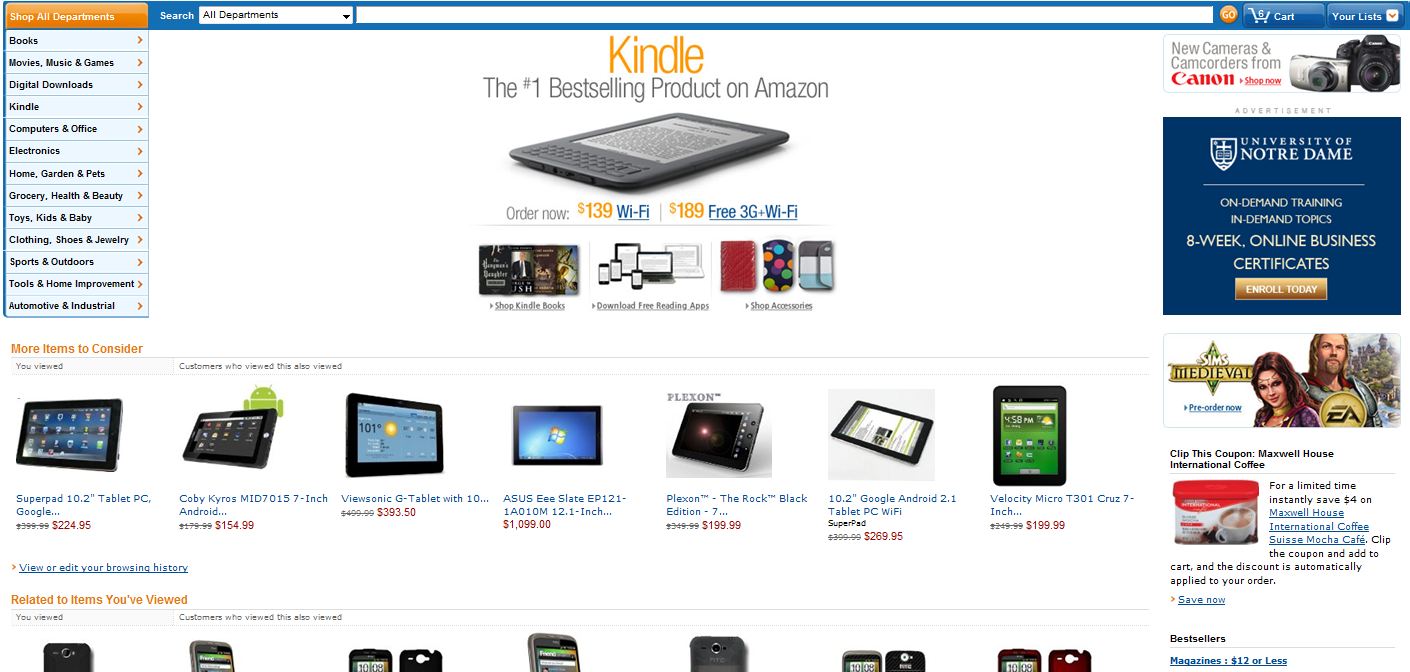
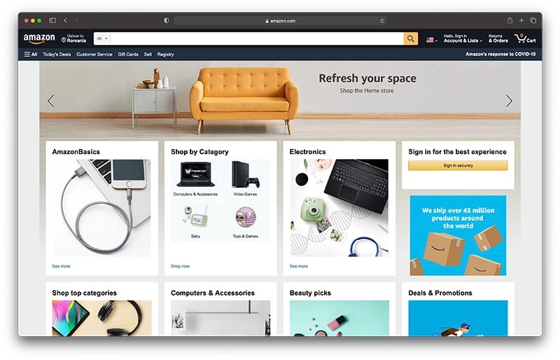
Many of us use Amazon to buy goods. Amazon has evolved dramatically over the years, continuously adapting the user experience to offer more services and products to customers. As customers of Amazon, we’ve also adapted to get the items we want and need. Can you recall what the Amazon user interface looked like less than eight years ago? We can’t, but we looked!

Fast forward to September 2021, and Amazon has an entirely different look and an ever-increasing array of offerings. Amazon has made the experience pleasant to indulge in and allows consumers to quickly get what they need, simplifying the steps required to purchase items. Like Amazon, Armstrong strives to make it easier to be more productive by streamlining processes for creating and managing loads, onboarding carriers, tracking shipments, invoicing, and receiving payments.

Sure, we’re concerned about how the screen looks on your end. But we’re also focusing on the experience of working with our TMS. It should be as intuitive as possible so you can operate quickly without running into hurdles or delays. We want you to have more time to focus on your business without being bogged down by navigation issues and unnecessary steps to get the information you need.
Another Day in Paradise?
 In January 2018, residents and tourists in the Hawaiian Islands received a frightening emergency alert on their mobile devices.
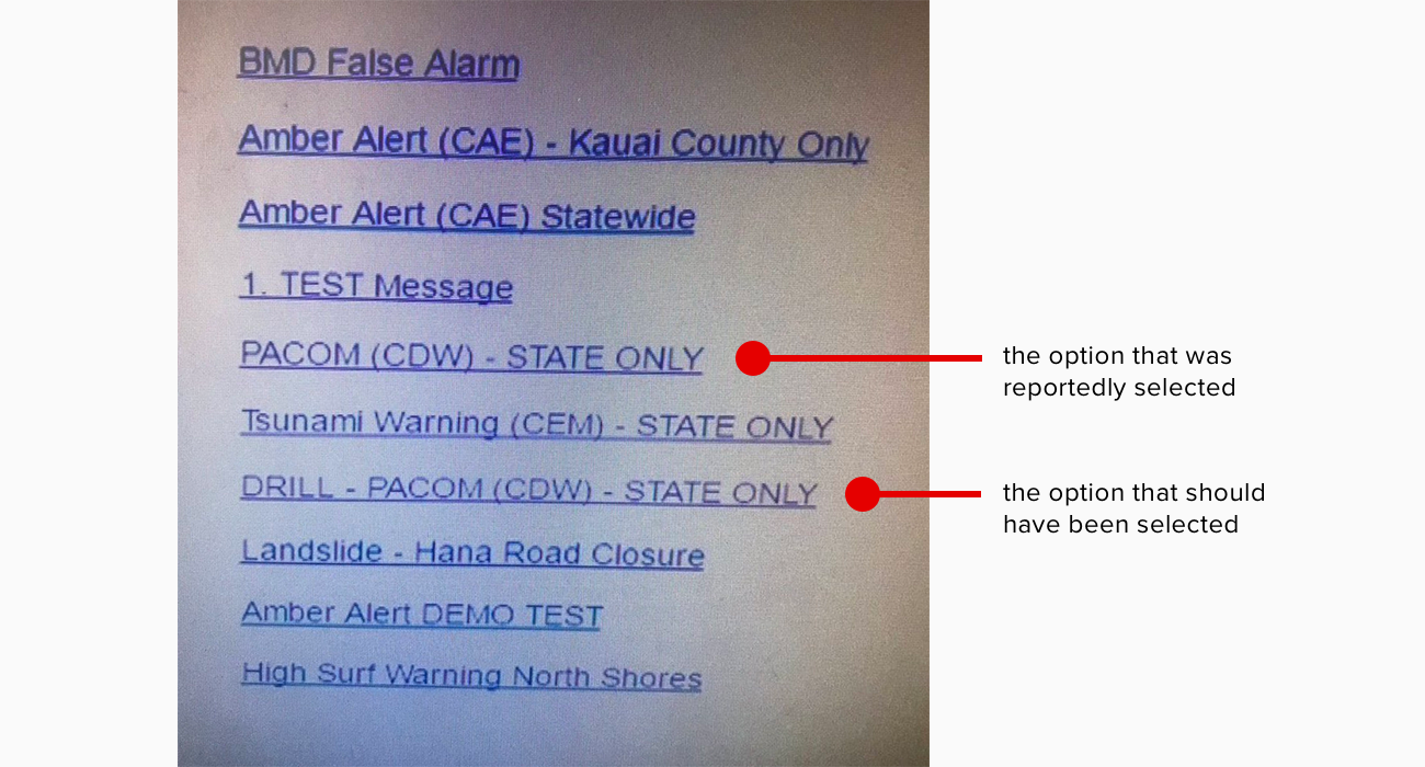
It was reported that a poor screen design caused the operator to inadvertently select an option that would send a live warning message of an incoming missile threat instead of the test message they had intended. How did this happen? If we look at the screen in question, you might agree this was an easy mistake to make.

This example reminds us how important it is to clearly present on-screen options. Ensuring a clear difference between test drills and live messages would be an excellent step toward preventing this problem from happening again.
To help create thoughtful user experiences, UX architects conduct research, interviews, and surveys, then translate that information into sitemaps, wireframes, and prototypes. Input from users is essential to understanding how they interact with systems or tools.
Want to Learn More?
Armstrong continues to invest in technology, and keeping the UX in mind is an integral part of our mission to find more ways to say “yes!” The design of our proprietary TMS is informed and influenced by our agents, customers, and carrier network.
Visit our Technology page to learn more about how we continuously evolve to support our customers, carriers, employees and agent partners. Subscribe to our blog and receive updates on the newest transportation, logistics, and technology insights.


